

BEIGE : Boring and Engineered to Identify with Gentrification and Eugenics
- Love Hannington

- Aug 4, 2025
- 10 min read
Updated: Dec 6, 2025
Updated foreword 6 December 2025, for the Pantone Color of the year 2026 being "Cloud Dancer"
It happened. They said the quiet part out loud. White Supremacy is unabashedly back, loud and proud. Pantone's color of the year is Cloud White, or 'landlord special' as I like to call it, as the world takes a hard turn towards fascism and away from a collective and cross cultural harmony .
The choice of the color of the year isn't unimportant as it signals a turn towards something we have quickly been gathering momentum towards; diluting and disbanding any sense of nature and culture. The brightness of turmeric dyeing your fingertips and you sprinkle it into a curry. The jewel tone of a pomegranate rose aker fassi. The sumptuous indigo on a West African Batik . It's intentional . And as you read on, you'll find out WHY colour is so very important for our culture and communties that express so much through the bounty of colour we're afforded in nature.
Shame on you, Pantone. White is not a colour, it is a shade.

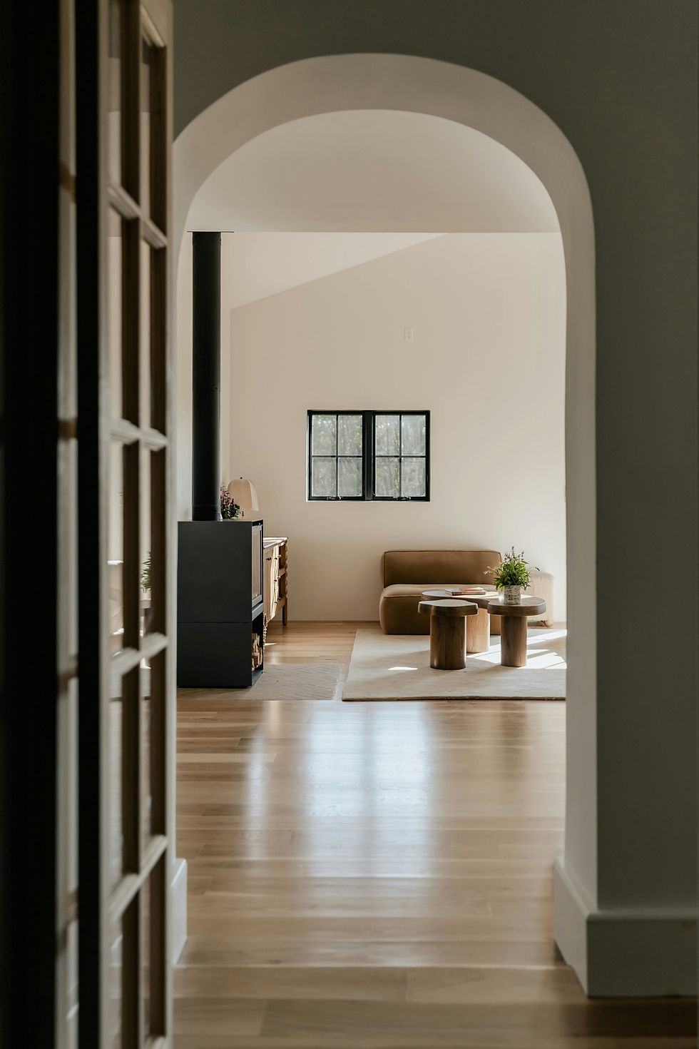
B.E.I.G.E- I came across this term - “Boring and Engineered to Identify with Gentrification and Eugenics” by doom scrolling through TikTok (as you do when procrastinating). Fascinated by how resonant the acronym felt to me, I decided to write my previous blog post introducing the term, which in turn, sparked a lot of interest in my inbox. So I thought I would explain and explore it further.
B for BORING
I think the best way for me to explore this idea, is to go allllll the way back to the very first bedroom I attempted to design for myself. I remember my room in my childhood East London home, which I think I had described as 'brighter than the sun’. My Mother had upgraded in jobs at the time, which meant a little extra money to transform my bedroom from the previous 00s Magnolia.
I had spent a lot of my childhood in and out of Homebase or B & Q , which was usually a chore and a bore. I mean, sure- I was allowed to pick out the odd trinket, or sneak away colour cards to cut up later, but I was there an awful lot. Taking on a fixer upper often meant that Mum needed to add on another tweak or fix to turn the Victorian terraced house into a comfy and warm home. As a child, you don’t really consider what it takes to turn a house into a home, and not just the money, but the deliberation on picking colours, taps, finishings. Well, that was until I was given a small budget to renovate my own BEIGE and boring bedroom.
At the time, they had these brochures in Homebase with all kinds of exciting kids bedrooms. All thematic too- You could choose a Mickey Mouse bedroom, or a Groovychick bedroom (Remember Groovychick? Anyone?), or a Toy Story Bedroom. In retrospect, the choices were actually pretty solid.

I had seen the bedroom of my dreams. It was green, and pink, and the colours were divided by a wavy horizontal line demarcating the two colours. 60s flower decals were scattered across the wall. It was quite possibly, the most amazing feat of interior design 9 year old me had ever seen. So- I requested it.
Unbeknownst to me, my Mum had a vendetta against the colours I was enamoured by. So pink and green- the colours of beautiful pink flowers, were switched instead for a bright cool yellow and luminous orange. The swoopy, horizontal mountinous wave was switched for a more tame hum of a vibration line, less of a fibonacci swoop, more of a flat vista. The flower decals, in pink and green, somehow no longer made sense and were never added, nor a replacement painted on.
Not wanting to be seen as an ungrateful kid (after all, my Mum didn’t have much money to spare and had made effort to renovate), I said my thank yous and spent the next 8 years in a room that you needed sunglasses for.
"The function of art is to do more than tell it like it is, it’s to imagine what is possible."- Bell Hooks
While I still mourn for the childhood bedroom I wanted and never received, I look back at the positive takeaways of the beauty of being surrounded by colour- even if gaudy and unchosen. I feel I would have preferred the colours over magnolia any day. It’s also given me a fierce need to be able to put a stamp on my environment in an appropriately vibrant way.
It may have been nothing I wanted, but I’ll tell you this. It was never boring. Everyone who was given the grand tour of the house and saw my bedroom, always met the space with delight. They’d applaud me on my creativity (and I’d grin on the outside whilst cringing on the inside). Tell me how much my room felt like a warm, sunny day. It sparked EMOTION. Conversation. Joy. And it did all of this because even the gaudiest colourful room has more life, energy and vibrance than the tamest beige/ greige/ magnolia space.

E is for ENGINEERED
All colours appear in nature, even beige. But not in the quantities that are currently being pushed within our sterile social matrix.
Everything that lives, and grows- even the things that don’t live and grow like rocks and crystals, emit an energy. A life force. Anima. And in doing so, create colours that reflect the light waves that travel to our retinas. We literally see life force through washed of colour.
Those colours spark feelings of nervous system safety. According to the University of Derby, colours can dilate blood vessels, stimulate fight or flight, or encourage a sense of calm.
"I found I could say things with colour and shapes that I couldn’t say any other way."- Georgia O'Keeffe
Then what of beige? Of greige? Of uninspiring ‘neutrals’
While nature has the odd beige splash here or there, it’s usually assisted in flavour with a sprinkle, or a tsunami of colour somewhere. Beige isn’t the main course, it’s an accompaniment. Like a little bit of side salad to help your meal slide down.
I strongly believe that the current beige trend is designed to lower the vibrations of young women in particular, who are prone to aligning with trends. By washing young women in a tsunami of beige and neutrals, their nervous systems which have symbiotically evolved in a colourful environment are being unnaturally surpressed, subdued.
It falls in line with the engineered and unnatural structure of Patriarchy- flattening the thoughts and feelings of these Women to become more palatable in line with society’s needs for a good and quiet little girl.
These structures are just that- structures. Like bridges or skyscrapers, they are engineered to maintain a status quo and to strip the self away from the spiritual, away from the divine. And while some structures are necessary for the progress of the species and betterment of the planet, moving away from colour isn’t one of them. It is a deliberately engineered plan to move us away from knowing we ARE nature.
IGE- (The REAL Agenda?) is for IDENTIFYING WITH GENTRIFICATION AND EUGENICS
The only places where you see swathes of beige are deserts, and the animals in which aren’t, but overall they’re not as full of life as a Jungle, or a Rainforest. The odd desert lizard, but not much in the way of the flora and fauna.
Even the Bedouin and other desert communities who live there find way to inject colour into their clothing and dwellings.

The Western capitalist world mirrors the desert: sparse, stripped of colour, and sterile in spirit. The grey buildings, maybe a splash of glass or a rust finish here or there if we’re feeling particularly fancy.
Visiting Antigua, my ancestral home as a child, was always a different experience to the grey and brick of London. The little wooden houses in the country were painted with pinks, oranges, yellows, blues, greens, as far as the eye could see. Interestingly, those houses were filled with community who knew each other, supported each other. Cooked outdoors and shared food and conversation with neighbours.
Not only did it look colourful, but it felt colourful too.
Many global majority cultures use colour to express kinship ties, celebrate important celebrations. Muted colours in fact, tend to be used for marking of death and funeral rites.
Islands like Antigua, Jamaica, far from the Caribbean in Hawaii- across the globe, really- are constantly fighting back against the newest BEIGE chain hotel, coming in, tearing down the flora, fauna and colourful housing, only to replace it with all white so-called ‘elegant’ cabins if you’re lucky, or a sand-coloured hotel reminiscent of beach sand. Don’t get me wrong- I LOVE the beige of beach sand, but you know- on the beach, next to the turquoise of the ocean and the gold of the sky and the lustrous green of the coconut palm. The locals lose access to beautiful beaches, to the verdant hiking trails where they went foraging for bright juicy mangoes as kids... and, in return, tourists get to take nice instagram pictures at waterfalls to show how worldly they are.
It’s not just the colourful beach towns either, it’s cities too.
Living in London most of my life has meant that I experienced first hand what gentrification looks like.
Step 1, Run down area is filled with graffiti. Step 2, Bring in the ‘street artists’ and ‘muralists’ to fill said areas and buildings with colour. In come the hipster coffee shops with milk variations galore.
But what's wrong with oat milk... and colour is good, right?
Wrong. (I mean, it's all good, but, not in this context ).
Step 3 includes moving in all of the people who were blessed to grow up in beautiful Devon and the leafy shires, with that lush green belt, and ocean spray, to the trendiest areas, like Hackney or Peckham, driving up rent and housing prices as career landlords prey on the new consumers (who, to be fair to them, are simply looking to leave their boring one-horse towns and find excitement and career in the cities. Can’t blame them).
Once those adventurous one-horse town types move into the cities, step 4 includes tearing down all of those colourful mural-filled buildings, the very last eyelash of ‘affordability’, only to put up, YOU GUESSED IT, more BEIGE and greige buildings. Those shire and Devon types, now blessed with inheritance from Grand Mama and savings from their city jobs move back to their childhood towns, leaving behind the new, shiny, expensive buildings that the grungy, grotty, colourful sort who grew up with the city now can’t afford.
The buildings that replaced the old mural-clad buildings pretty much never get put up with the colourful, full of life type of fairy-drawing-in gardens, or parks. They rarely get put up with big, bold spaces for local artists to be commissioned to decorate regularly.
Always sans nature. Always sans art. Always sans life.
You’re lucky if the architect designs a building with a plant wall on the side- and then luckier still if that building continues to be watered so it doesn’t transform into a crispy mess reminiscent of death and dying leaves…

…Rinse. Repeat.
What we’re really dealing with here is a sanitised aesthetic with eugenic roots. Eugenics isn’t only about controlling bloodlines, it’s about controlling vibrancy. The fight and the wildness of people who are so safe and happy in community, that fighting for their way of life is worth it. Controlling joy. Controlling life-force. It’s about removing anything too wild, too Sovereign, too unpredictable, too other. In architecture. In communities. In spirit.
The obsession with uniformity, with “clean lines” and “neutral tones" isn't a Pinterest trend alone. It’s an overt violence that the uninitiated simply do not see. A visual language that says: difference is dangerous, wonder and joy is weakness, colour is chaos.
That’s the hidden belief system underneath so much of what we’re told is “good taste.” And when difference is seen as a threat, it justifies flattening it. Replacing it. Silencing it. That flattening shows up in everything from redevelopments in Peckham to the bombing of Palestine. The logic is the same: strip out the vibrant, the unpredictable, that which is indigenous to land and to human spirit, the sacred, and replace it with something that looks “clean,” “safe,” and “controlled.” Something that doesn’t make the dominant culture uncomfortable. Something that will make the top few a whole lot of money.
It’s about power, not taste. And when we choose beige over boldness, absence over presence we’re not decorating; we’re deciding what kind of world we want to live in.
Whether its the colourful beach towns fighting for their right to swim at their local beach, or the city-born-and-hardened who simply like to look at some street art while making their way to the job they've been coerced into through the threat of survival, so many of us are losing this valuable access to colour, this valuable access to the boldness that life promised us, in favour of profits.
On the other side, when we choose colour, we’re remembering and recalibrating our higher self. Remembering our communities, our roots. Remembering that we are nature, and not separate from it. It is a sacred and spiritual reminder of life that reminds us of the preciousness and shortness of it. And that reminder connects us to the divine- both inner and higher.
BEIGE- Is it worth it?
Next time you reach for that all-beige gym set, or pick out another beige vase to match your beige settee for your beige living room (I’d call it a dying room, but fine), I want you to stop and feel into what that choice is saying. Not just about your style, but about your spirit. About what you’ve been told is acceptable, desirable, safe.
Because that choice between colour and the absence of it, between life and blandness isn’t just personal. It’s a collective consciousness spell we’re all either feeding or breaking. Every time you choose neutrality, you’re casting a vote for the systems that want to flatten everything vibrant, sacred, and alive. You’re letting them win ( and we all know who they are).
They are the ones who told your ancestors to quiet down, to hide their magical connection to nature. The ones who paved over community gardens with parking lots and high rises. The ones who edited the magic out of everything, called it woo woo and called their way, progress.
Your aesthetic is energy. And energy has consequences. So choose like it matters, because it absolutely does.


We are not talking about this enough, we deserve to be bathed in colour and life energy! Thank you for reminding me of this vital message.